Tuesday, December 15, 2009

Yousuf Karsh: Grey Owl

GREY OWL


Yousuf Karsh

Grey Wolf, (Archibald Belaney) 1936

When I first walked into the Karsh exhibit I was struck by how dark the prints were. Because of this I was instantly drawn to the lighter prints. While I really liked a lot of the prints I decided to choose the print of Grey Owl. This shot was taken in 1936. What caught my attention right away was that even though the print is dark, Grey Owls eyes pop out. I also liked this print because it seemed to be softer than the rest of the collection.

The area around Grey Owl has some depth and detail and I think that Karsh would have probably preflashed the paper prior to exposing the negative, as there is a difference in tones between the background and Grey Owl. Karsh shot on a full frame camera and because of this his negatives were 8x10 so when he would have made his prints they would be more sharp and in focus because they would not have been as much enlarging. Karsh may have also made contact prints of his images because of the size of his negatives also contributing to the sharpness of the images. This particular print of Grey Owl is sharp and has an even contrast so I think that Karsh probably added a magenta filter and finished the print off with a soft filter to make the skin tones of Grey Owl softer. I don’t think that Karsh dodged or burnt anything on the image, as Karsh was technically precise with his lighting so I think he would have achieved the tones he wanted based on preexposure work rather than post exposure. However is saying that Karsh may have dodged the area around Grey Owl’s eyes as they do appear very easily in the dark shadow of his hat.

I really like this print of Grey Owl, I like the fact that his rough bush lifestyle was captured with a soft feel. So many pictures of Grey Owl are taken with environment as the background because he is about his work and lifestyle. What I like about this print is that this is just a close up of his face so that we can see the struggles of his life on his face. The expression on Grey Owl's face suggests that he is not happy with being posed but he also could be in deep thought about his situation in life.

Thursday, November 26, 2009

Colour Block

There are colours all around us, and I like them all equally so when someone asks me what is your favourite colour I never know how to answer. I think that colours are like moods, you choose one to wear for the day. You buy something with a certain colour depending on how you are feeling. When it come to my kitchen I like bright warm tones, therefore I have many differnet objects that catch your eye. I used my kitchen for a lot of these shots as I like what I see there because I get to choose the colour combinations that go together. For Similarity colours I choose to shoot lemons and limes because I think there two things go so well together. Not only do you often find lemons and limes together in the grocery store but their shape and colour tone are similar. When I look at lemons and limes I feel relaxed because they seem to fit which makes me relax becuause you know in some way that if you find two things that go together things will be alright. Not only do the colout tones go together but I think the texture plays a role in lemons and limes fitting. Becuase they have a simiar skin the light hits the fruit in the same way and creates equal darks and lights that makes you feel balanced and whole. Like one in the same.

For Complimentary colurs I choose to shoot tomatoes and cilantro or corriander (depending on who you ask). Salsa just isn't salsa with out tomatoes and cilantro and it fits that their colurs also happen to be red and green. When I look at complimentary colours including tomatoes and cilantro I feel calm and happy because you know that even though things are different they can still go together. There is also something in the way the colours of food evoke a sense of hungry obviously but refreshed and a sense of ahhhhhh. We al associated complimentery colours with events and holidays and it is almost like viiting an old friend when you see two things fit together.

I enjoyed this project and I found it easy to find colours in my home and in finding ways to combine objects and colurs to make the either pop or fit.

Friday, October 30, 2009

Zoo

Well it was a cold day to be outside but I did it. The zoo I have never been a huge fan of the zoo buy it is always a neat place to check out and visit. I think some of the highlights of the day were being in the tropical house even though I fogged up because I got some nice soft shots. I also got to go on a bit of a backstage pass because I asked one of the workers were the bison were and he told me they were in the barn. He then took me to the barn to see the bison and get some cool close up shots. Today was a good day I got to see the animals, take some neat shots and be outside in the fresh air even though it was cold. Today made me realize I would like a new lens and I am thinking a telephoto to keep working on interesting shots.

Tuesday, October 20, 2009

AT6.2 Photographic Hero

Arno Rafael Minkkinen

I have chosen three prints to look at by Arno Rafael Minkkinen there were all taken in the 1970s. I could not find out what kind of kind of camera Minkkinen used but I am assuming that it was a film camera considering that this was before digital cameras came into the picture. Considering that Minkkinen is an artist I think that he would have developed his own film and developed his own prints. Minkkinen’s work is mainly black and white self-portraits where he finds a way to incorporate his body into the scene he is shooting.


The first print that I am going to look at is a portrait of Sandy Pachaug in 1970. I am assuming because it was taking in 1970 that it was taken on film and developed by Minkkinen himself. This print is of a girl sitting in a canoe with her back facing us. In my opinion I find the print a little over exposed because there is very little detail in her back and the blacks are not as black as they could be. I find there to be an overall grey feel. Which makes the image seem like there is not much contrast as most of the image is in the medium grey range. In terms of the format I like the way the picture was created there is a simple feel to it and the shallow depth of field adds to the image. I find the image grainy but it could be from being scanned and it is hard to tell if there have been touch ups done on the computer. I think the way the image was cropped is perfect there is enough of the background to give meaning to the picture the focus is of the girl and the canoe, I like the softness of the picture and it adds to the subject.


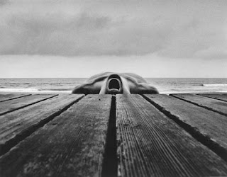
The Second image I am going to look at is a self-portrait taken in Narragansett, Rhode Island in 1973. It is a picture of a dock and Minkkinen is lying on his back with his head to the dock. I think that this picture is exposed perfectly the lights are the right shade as are the blacks. The contrast is good and the picture is cropped very effectively it makes the image strong and bold and the lines on his body mimic the grain in the wood of the dock. The picture is dark at the bottom and lightens up as you follow the lines of the body to the sky. This picture is not as grainy as the first picture I looked at but again that could be attributed to the fact that this print was probably scanned and might have been touched up on the computer. I like this picture it reminds me of a cross by the way the body is perfectly balanced with the edge of the dock.


The third picture I chose to look at is a self-portrait with Daniel, called "The First Noël” it was taken in Andover in 1979. I think that this was again taken on film and developed by him. It is a picture of a baby sitting on the floor looking up; Minkkinen’s legs frame the baby, which creates a frame within a frame. I think that the picture is exposed correctly but in saying that there are some darker areas being the right upper corner. I think that the light is soft in this picture and the baby is exposed correctly as are the legs, which created good contrast between the shades of colour. The edges of the picture are a bit grainy and could be a little out of focus but it is hard to tell as again this picture has been scanned. I like the image it is simple and I like that it is centred because we follow the gaze of the baby up and we are able to imagine what is beyond the frame. I like this picture and the contrast between the soft baby skin and hairy legs adds to the texture.


In general I really like Minkkinen’s work. I have been fortunate enough to see his show when it was at the Winnipeg Art Gallery. As with all of the prints I think in real life they would be a bit grainy but because they have been scanned and have possible had the opportunity to be touched up using the computer. I like his subject matter and the way that he is able to find ways to fit his body into the landscape he is working with. The simplicity in the naked body is reflected in the nature environment. I like the feel of his pictures. I have always liked the look of film and rustic simple feel to all pictures taken with film. I think that because of this it adds to Minkkinen’s prints, as film just seems to enhance the look and feel to his body and nature.

All information and pictures were taken from the following website:
http://www.arnorafaelminkkinen.org/

Thursday, October 8, 2009

Composition at Home


Depth


Symmetrical Balance


Texture


Pattern or Rhythm


Shape or Form


Line


I found this assignment more challenging than 100 ways because I wanted to use the natural light that was outside and I was not able to capture the light inside as easily. I did manage to find some neat ways to look at some of the things I found in the house but at times I needed to give myself pep talks to get going and shoot. I did find that once I got into it, I found it easier to look at the house in a new way. It was a good learning experience and I am glad that I challenged myself to keep at it and I am thinking that when I move I am going to redo this assignment and see what I can find in my new house.

Monday, October 5, 2009

Thursday, October 1, 2009

100 Ways


100 ways. At first when we were asked to pick three objects and shoot them, I was overwhelmed by the thought of having to shoot 100 pics of the same three things. I sucked it up and went into it was an open mind. It was a beautiful afternoon and decided that I needed to take the opportunity to spend some time outside. I took my three objects: mandolin, vase, and lawn chair and set them up under the apple tree. The first 30 pics were easy to shoot because I was looking at this project with fresh eyes, but as I got up to 60-70 pics I was struggling with finding new ways to look at the objects and shoot them differently, so I took a little break laid down in the grass looked up in the sky ate an apple, and got a renewal of energy that made it hard to stop at 100 pictures! I really liked with project and I liked the shots I got, the light was great and the objects I picked really sparkled in the bright sunshine. I think that this project was a great way to look at things differently and I am going to use this idea in the future to give myself a creative break when I have a photography block.

Sunday, September 20, 2009

Lines, Lines everywhere are Lines

Lines are everywhere this I know but when asked to capture 30-50 images it can be a bit challenging. After shooting in the exchange district all week I decided that I needed to take a break and find some new inspiration. When I think about lines I see fences, fields and old buildings and there is only one place that I know of to find this and that is home. So I took a little field trip to clear my head and find some neat shots of lines. Some of the challenges I had with this project were capturing the image I was seeing with my camera, but I am sure we are all facing that challenge. I also found numbers and shutter speeds racing through my head and I often needed to find a way to turn my brain off. I liked the project and I like a lot of the pictures that I found. At first it might not be clear what I was getting at but if you look closely I think you will get what I was seeing.

Check out my Lines and see for yourself.

Monday, September 14, 2009

Assignment 1- Sept.14, 2009


Well this is my first official post to my brand new blog page. I have chosen to add this picture because it says summer to me and since we have had very little summer I am going to surround myself with all things summer I can find. In terms of what I like to shoot I would have to say everything that I find interesting which really doesn't narrow it down but as I add to this blog I think my style will start to become apparent. I have many favourite genres of photography but two of my favourites are landscapes and food, surprise surprise. I am currently enrolled in a 10 month diploma program. From this program I hope to learn how to use all of the functions, ins and outs, bells and whistles of my two cameras so that I feel comfortable taking pictures in every situation. I also hope to learn how to take better pictures and use all the programs and tools associated with being a photographer. Some of my best photo related memories are of working with Henry in Morden in his darkroom, developing my own film and learning how to use some of the equipment. There in not one specific memory that stands out but those couple of days that I was there really instilled my interest in photography and laid the foundation for my ever present desire to have photography in my life.

t